Heat maps with conditional formatting
- Shem Opolot
- Sep 20, 2021
- 3 min read
Hi friend! Welcome back to this week's blog. This week I have twice the content for free, as my first YouTube video will also be released today. Check it out here if you haven't already.
Ok, enough self promotion. Remember last week when I told you Yücel was on vacation? Well, I also promised to share a bit about that, so here is some continuity and character development for you.
Creating a heat map
Yücel has been overworked recently (If you don't know Yücel, that's what happens when you skip class. Read this). It turns out being an artist is not easy and this is why his parents wanted him to study engineering or medicine (please stop if this is a trigger for you). Yücel gives an employee, Tuna, a list of cities all over the world he would like to visit and asks them to check what months would be perfect for a 2-month vacation. Yücel does not offer a lot of guidance to Tuna but insists "sun exposure protects against epidemics." Tuna accepts willingly even though this is not part of their job description. Capitalism is not easy.
After rigorous research, Tuna comes up with the following information and places it in a Google spreadsheet (here is the sheet in case you want to empathize with Tuna):

Tuna cut down the options to 10 cities and added the average monthly temperatures in degrees Celsius (°C) for each city. Tuna is a star! More so, Tuna is an overachiever and wants to make this information easy for Yücel to read. Tuna decides to use conditional formatting to change the colors of the cells based on the temperature values in the cells. This way Yücel can know at a glance where and during what months they should visit.
How does Tuna change the colors of the cells?
Step 1: In the google spreadsheet, Tuna selects the values she wants to format

Step 2: While the values are selected, go up to the tool bar, under Format, and select Conditional Formatting

Step 3: The conditional formatting window opens up on the extreme right side of the window and Tuna selects Color Scale instead of Single Color

Tuna can already see the conditional formatting in action as the default color scale changes the appearance of the cells based on the temperature values in the cells. Tuna could stop here but they want to use color more strategically. Tuna knows that people often use the red-white-blue color scale when referring to temperature—red for very hot and blue for very cold.
Step 4: Tuna changes the color scale as follows: Minpoint (Min value) - blue, Midpoint (select Number) - white and Maxpoint (Max value) - red. The colors of the cells change in real time, and Tuna clicks Done when she is satisfied with the outcome.

Step 5: Tuna marvels at her masterpiece

Interpreting the heat map
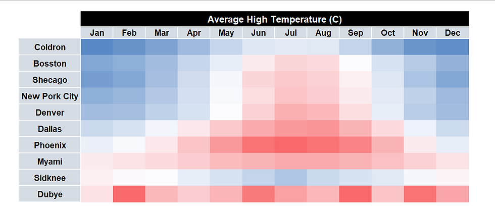
Tuna shares the heat map with Yücel and they are pleasantly surprised. Yücel's eyes are immediately drawn to the red and they quickly choose to visit Phoenix from July to August because the local herbalist said intense heat can cancel all one's sins (I did not say Yücel was perfect).
Bonus feature
In Excel, you can hide the temperature values and just have only the colors visible. But be careful when you do this, as the numbers do add valuable context. However, hiding the values works for Yücel who just wanted to see some red. Tuna hides the values by selecting all the values first, right clicking, and selecting Format cells. In the Format Cells window, select Custom. Under Type: delete whatever text is in the space and enter 3 consecutive semicolons ";;;"

In this case, the final product would look as shown below:

Conclusion
Conditional formatting comes to the rescue again. Can you think of other ways to use conditional formatting in your work? These are the kind of features that can make your work just a tad bit more pleasant.
See you next time!
PS: If you have any questions, comments or concerns about any of the concepts I have tackled in this article, OR if you know better tricks, please reach out to me. I would love to hear from you. Otherwise, please subscribe to this blog for more updates.


Done!!!...😌